New Dashboard
The Create Dashboard page is similar to creating a new report in the ad-hoc editor.
This page is interactive and displays Available Content on the left side of the page; the Canvas allows you to customize your dashboard layout.
This topic goes into quite a bit of detail on creating a dashboard; visit the Create a Simple Dashboard topic.
For detailed help working with dashboards, you may also visit the Jaspersoft Community help site directly.
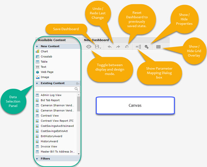
Available Content
The Available Content panel contains New Content, Existing Content, and Filters.
Each section may be expanded and collapsed as needed.
Click the right-facing arrow ![]() to expand the content section.
to expand the content section.
Click the downward-facing arrow ![]() to collapse the content section.
to collapse the content section.
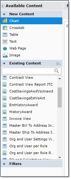
New Content
Located at the top of the Available Content panel is the New Content section.
These are dashletdashlet elements that may be added to your dashboard.
-
The Chart, Crosstab and Table dashlets are based on your existing published reports and/or ad-hoc views.
You will be prompted to select your data source.
-
You also have the ability to add in Text, a Web Page, or an Image.
NOTE: The Image must be stored in a repository with a direct URL.
Click an element to select it and then drag-and-drop it onto your canvas. You will be prompted to select your data source.
See topic on New Content for detailed information.
Existing Content
By default, the Existing Content section displays both published reports and ad-hoc views.
Located to the right of the Existing Content label is a small menu  icon that, when selected, lets
you choose the view and the existing content.
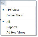
NOTE: Proactis recommends that users use the default List View
to avoid any confusion.
-
Select Reports to filter the Existing Content panel to display only published reports.
-
Select Ad-Hoc Views to filter the Existing Content panel to display only ad-hoc views.
This section of the panel allows you to search for a partial or full name of a published report or view using the search field.
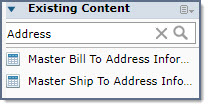
Enter a partial or full name of a published report or ad-hoc view and click the magnifying glass  to launch search.
The Existing Content section will refresh to display only those reports or views that match your entered search criteria.
To clear the search, click the  . The Existing Content section will refresh to display
all reports and/or views.
Left or right-click a content element to display the Path or Description and Path, depending on whether it is a view or published report.
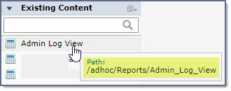
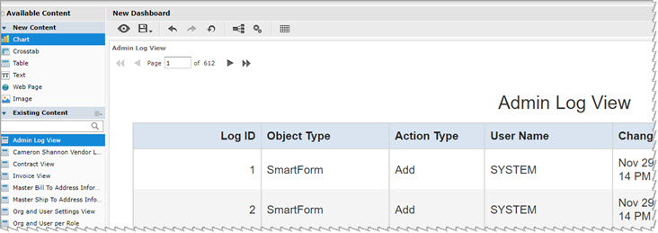
Click a published report or ad-hoc view to select it and then drag-and-drop it onto your canvas.
Filters
This panel will populate automatically with applicable filters.
These will vary based how your published reports or ad-hoc views were built.
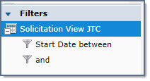
These are read-only, however, they identify the filter that was applied to the report or view.
Right-click or double-click to view the path.
Canvas
Located in the middle of the canvas are the basic steps to follow to start building your dashboard:
-
Drag an item from the Available Content panel onto the canvas to create dashletdashlet.
-
Use automatic placement or drag the edge of a dashlet to resize it.
-
Use the Properties button
 in the toolbar to set dashboard-level properties.
 -
Double-click on a dashlet to edit its properties. Right-click a dashlet to view all available options.
Dashlet Properties
After you drag and drop a content element onto your canvas, you may double-click it or right-click to open the Dashlet Properties window.
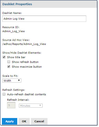
Work with these properties as follows:
-
Dashlet Name - Modify the name of the dashlet as needed. Be advised that this does not change the data source name, (report or view), nor does it change the title of the data source. The name of the dashlet appears in the upper left-corner of the dashlet.
-
Resource ID - This is a read-only field and may not be edited. It identifies the resource name as it exists in the database.
-
Source Ad Hoc View - This is a read-only field and may not be edited. It identifies the data source, (report or view), path for the dashlet.
-
Show/Hide Dashlet Elements -
-
Show Title Bar - By default, this box is checked, which includes the Dashlet Name, Refresh button, and Maximize button.
Clear this box to hide the title bar.-
Show refresh button - By default, this box is not checked. If you check this box, the Refresh
 icon
will be available to end users
when they view the dashboard. Selecting this icon forces a manual refresh of the data being viewed. Leave this check box cleared to
keep the Refresh icon hidden.
 -
Show maximize button - By default, this box is checked, which means the Maximize
 icon
will be available to end users when they
view the dashboard. Selecting this icon expands the dashlet to its maximize size in the browser window. Clear this check box to maintain
dashlet size and disallow end users to maximize it.
-
-
-
Scale to Fit - Use the drop-down menu to determine how the dashlet should fit on your dashboard.
Options include: None, Width, Height and Dashlet. The default value is Width.
You are encouraged to select Apply at the bottom of the Dashlet Properties window to view the impact of changing the Scale to Fit options. -
Refresh Settings -
-
To automatically refresh the contents of the dashlet, check the Auto-refresh dashlet contents box.
-
Once checked, enter a numeric value to represent the refresh interval or frequency rate that the data should refresh. Use the drop-down menu to
select between minutes or seconds.
-
Click Apply to view the impact of any changes you have made to the properties. The Dashlet Properties window will remain open.
Click OK to save the changes and close the Dashlet Properties window.
Cancel discards any unsaved edits and closes the Dashlet Properties window.
Dashboard Properties
Select the Show/Hide Dashboard Properties ![]() icon on the toolbar above the canvas to open the Dashboard Properties window.
icon on the toolbar above the canvas to open the Dashboard Properties window.
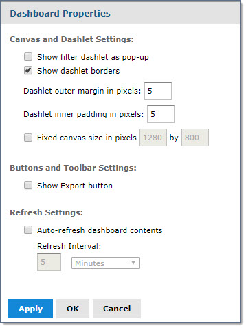
Work with these properties as follows:
-
Canvas and Dashlet Settings -
-
Show filter dashlet as pop-up - Check this box to display the Filter
 icon in the toolbar. Filters are discussed in more detail here.
-
Show dashlet borders - By default, this box is checked. You may choose to clear the box so there aren't any border lines visual between the dashlets.
-
Dashlet Outer Margin in Pixels - Enter a numeric value to represent the number of pixels that the system will use to create an outer margin. It creates white space between each of the dashlets. You must enter a value in the range of 0 to 20 pixels. You are encouraged to select Apply at the bottom of the Dashboard Properties window to view the impact of changing the margins.
-
Dashlet Inner Margin in Pixels - Enter a numeric value to represent the number of pixels that the system will use to create an inner margin. It creates white space inside each of the dashlets. You must enter a value in the range of 0 to 20 pixels. You are encouraged to select Apply at the bottom of the Dashboard Properties window to view the impact of changing the margins.
-
Fixed Canvas Size in Pixels - If you wish to determine a specific width and height instead of dynamically re-sizing based on the browser window, enter the desired width and height of the dashboard. It is recommended that you do not designate a fixed size as the impact to various users working on different browsers may be negatively impacted.
-
-
Buttons and Toolbar Settings -
-
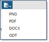
Show export button - Check this box to allow users that view the dashboard to export it out to a PNG, PDF, DOCX or ODT type document.
-
PNG - Portable Networks Graphics; image file.
-
PDF - Requires Adobe™ Reader to view.
-
DOCX - Microsoft™ Word document - 2010 version or later.
-
ODT - OpenDocument Format Text File.
-
-
-
Refresh Settings
-
To automatically refresh the contents of the dashboard, check the Auto-refresh dashboard contents box.
-
Once checked, enter a numeric value to represent the refresh interval or frequency rate that the data should refresh. Use the drop-down menu to
select between minutes or seconds.
-
Click Apply to view the impact of any changes you have made to the properties. The Dashboard Properties window will remain open.
Click OK to save the changes and close the Dashboard Properties window.
Cancel discards any unsaved edits and closes the Dashboard Properties window.